

YEARNING
FOR
CONNECTION
16/01/25

creation process below photography"I’ve long been drawn to the idea of creating a textile piece around the theme “yearning for connection” as those words spark many thoughts within me; love, life, society, identity, appearance, stories, and people as a whole.
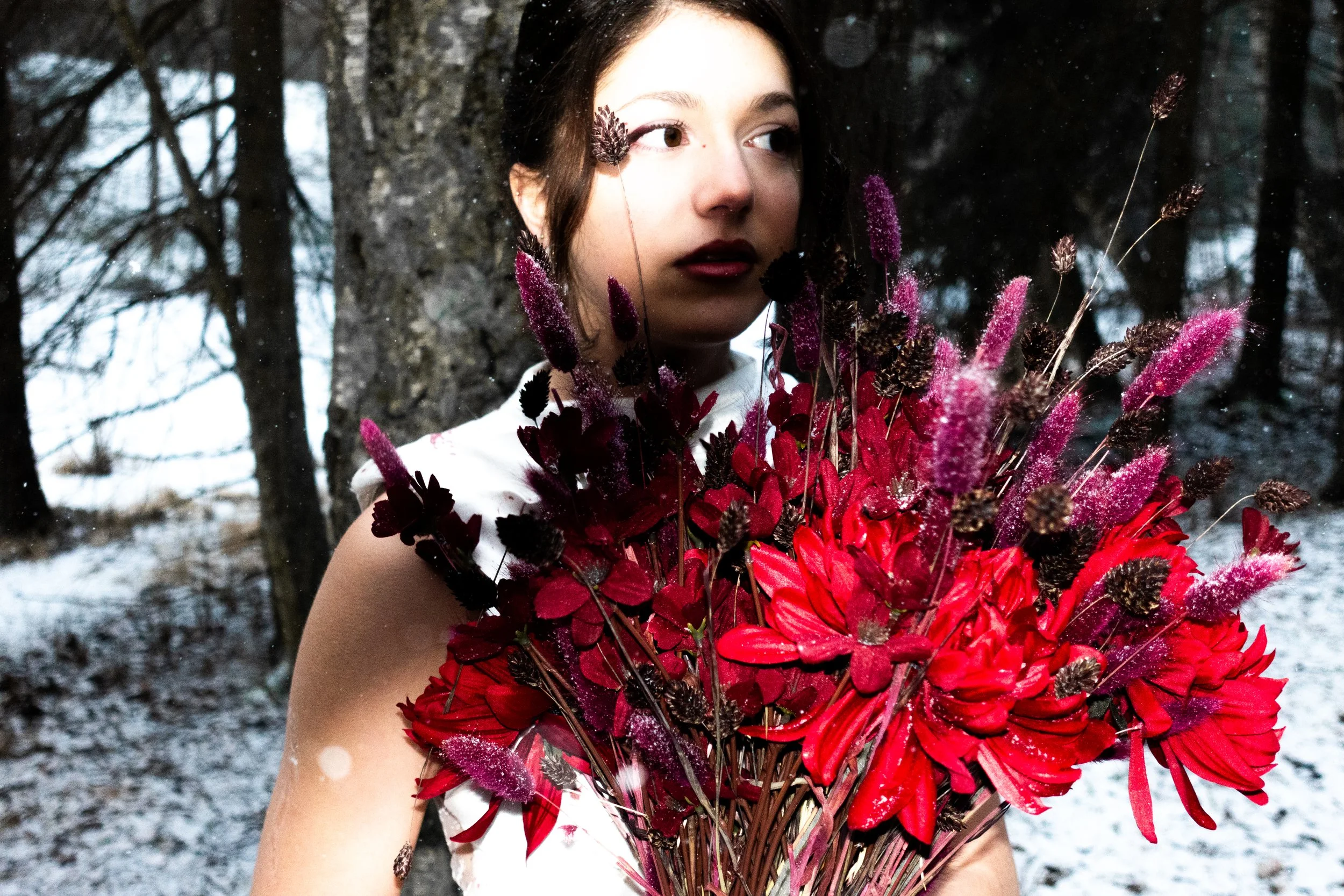
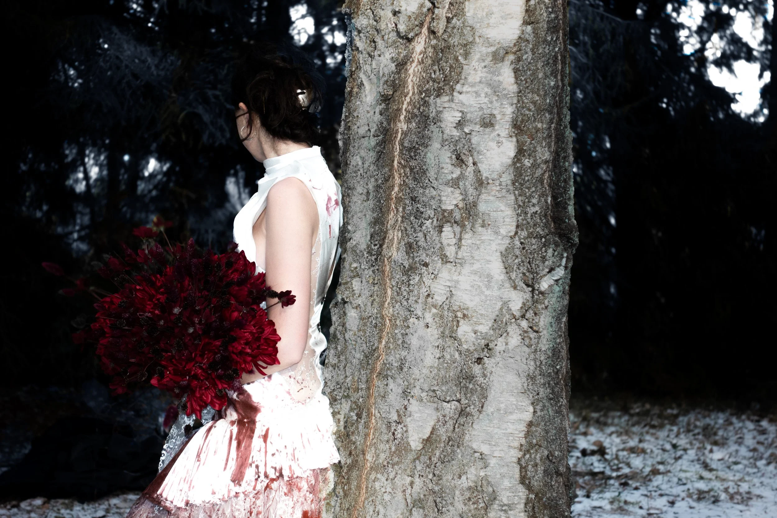
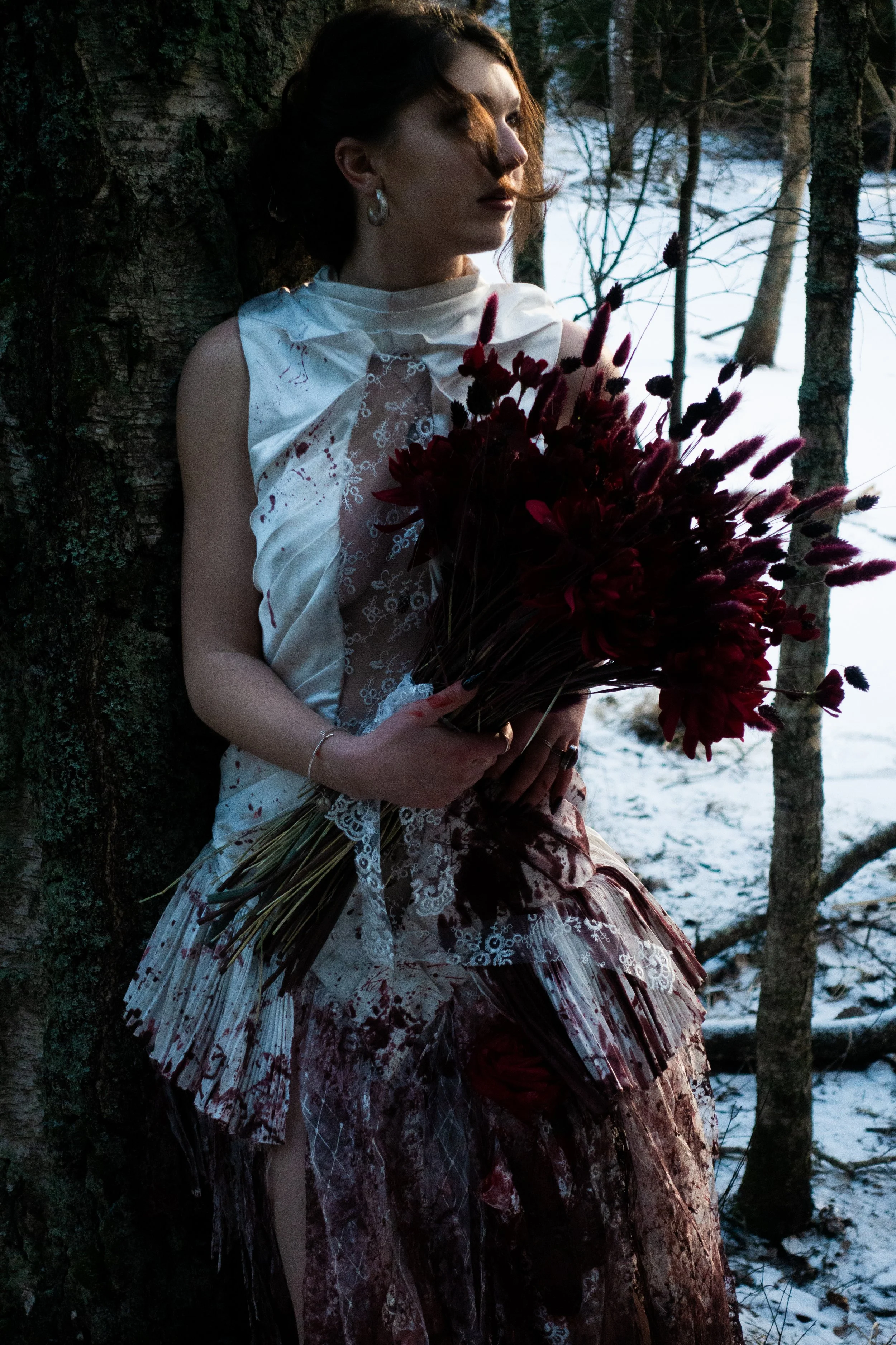
The reason I chose to create a bloody wedding dress for this theme was to express as many layers of connection as possible, captured in a single garment.
The three core themes I worked with are Love, Death, and Yin & Yang.
LOVE:
The wedding dress represents marriage, one of the strongest connections two people can have, especially from the perspective of society and the law; To give oneself body and soul to another, in life and death, in sickness and in health, out of love, is such a powerful bond that people mark it physically with rings as a lifelong symbol of unity.
DEATH:
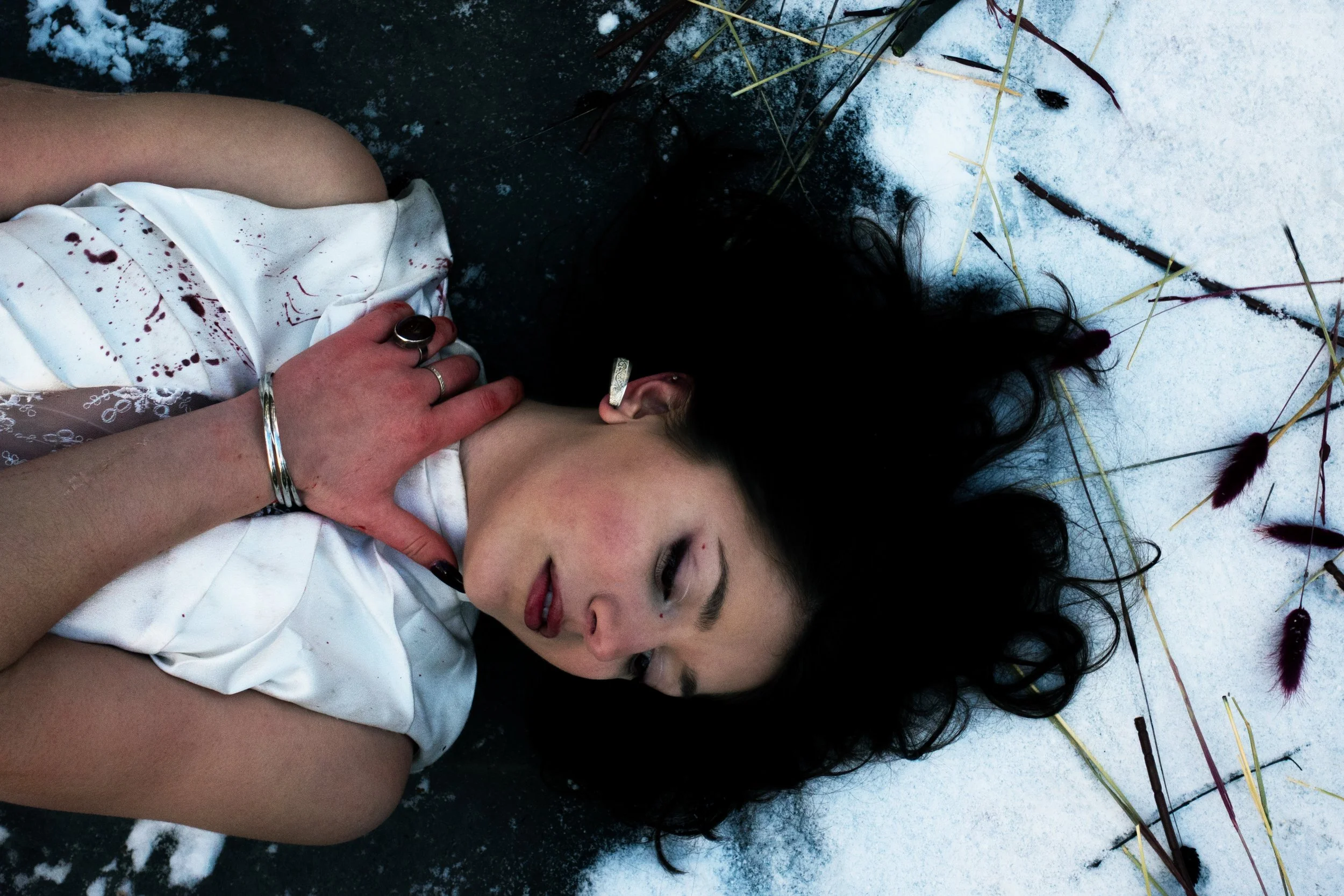
The blood and dirt represents the opposite side of love. Love is warm, bright, and inviting, while death is cold, dark, and repelling. (Yin & Yang). No living being escapes death. It comes for everyone, regardless of who you are: rich or poor, beautiful or unattractive, tall or short. In the eyes of death, everyone is exactly the same which makes it a universal connection we all share.
Blood in the design also represents the history of ones falsehood; what people do or change about themselves to create the illusion of connection, even if it doesn’t reflect who they truly are. People may wear makeup, undergo cosmetic surgery, dress or behave differently, even betray others. all in an effort to make themselves more accessible or desirable in their pursuit of connection.
YIN & YANG:
Love can symbolize the beginning of life, while death represents the absence of life. Love is a symbol of hope, while death reflects despair.
I believe most people yearn for both of these connections in different ways, whether it's longing for a dream job, a partner or a child. Everyone has something they love. But many also carry something they wish would die; a painful past, a version of themselves, or even someones or your own life.
Some people are searching for love. Others, for death. and most are longing for both.
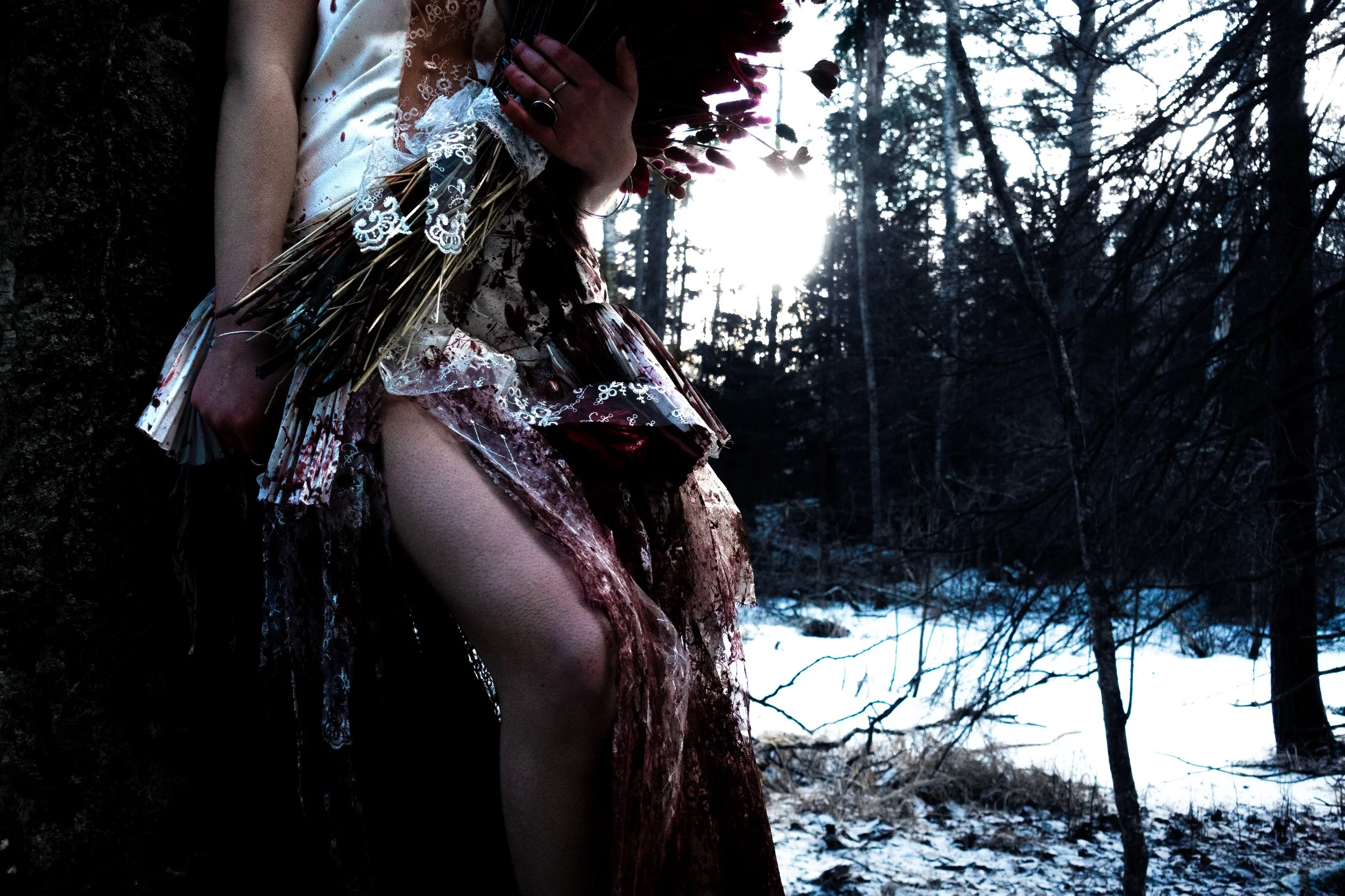
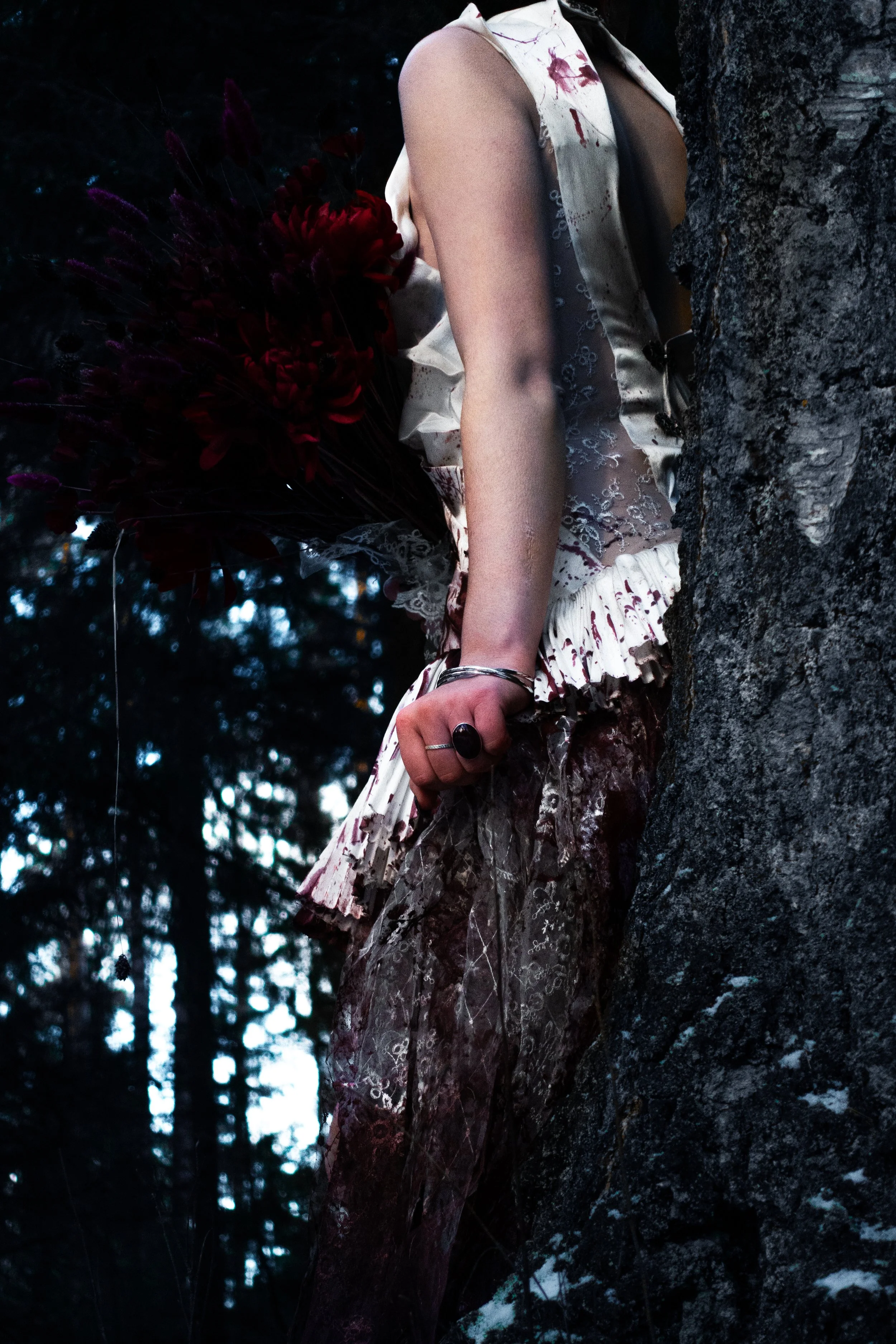
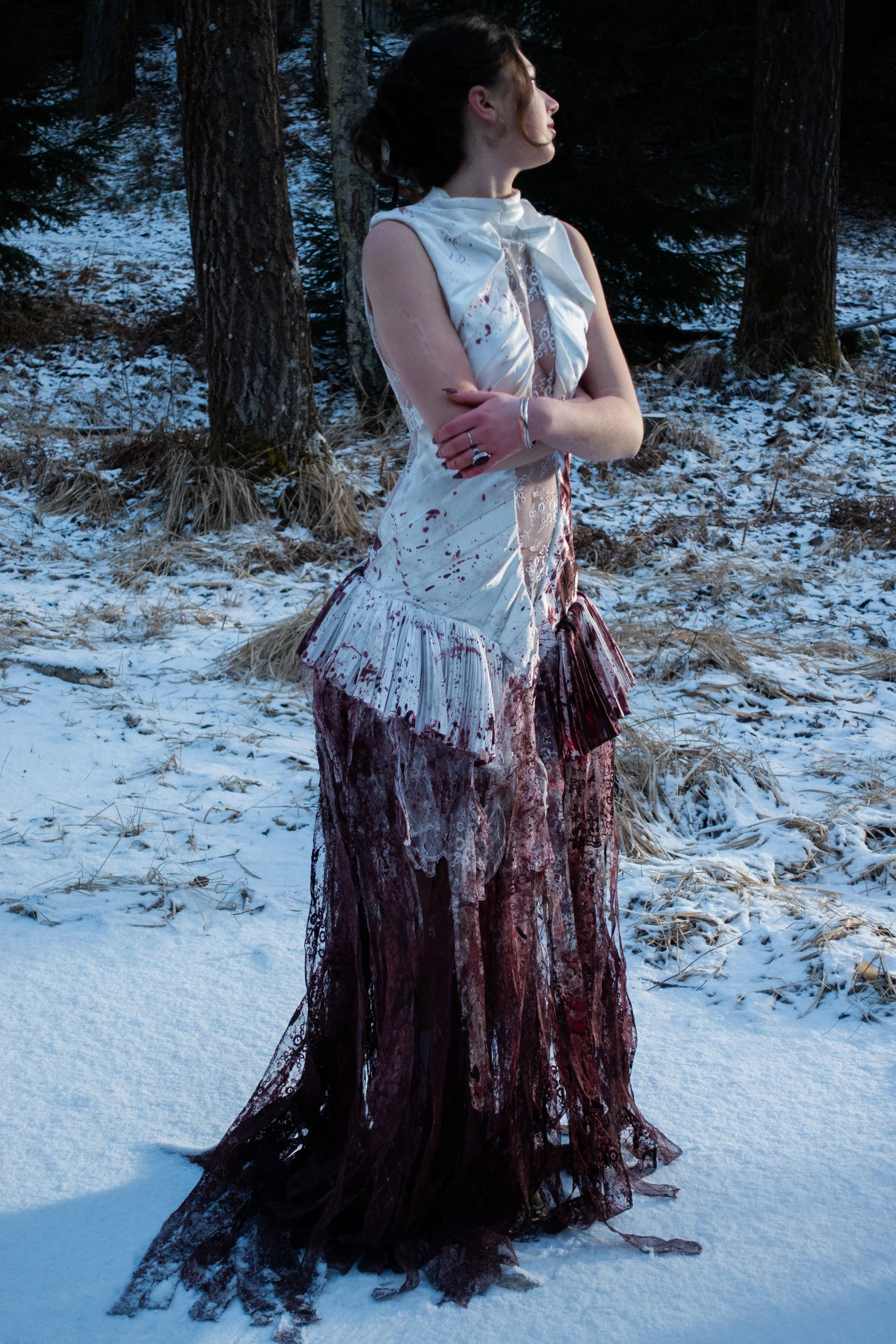
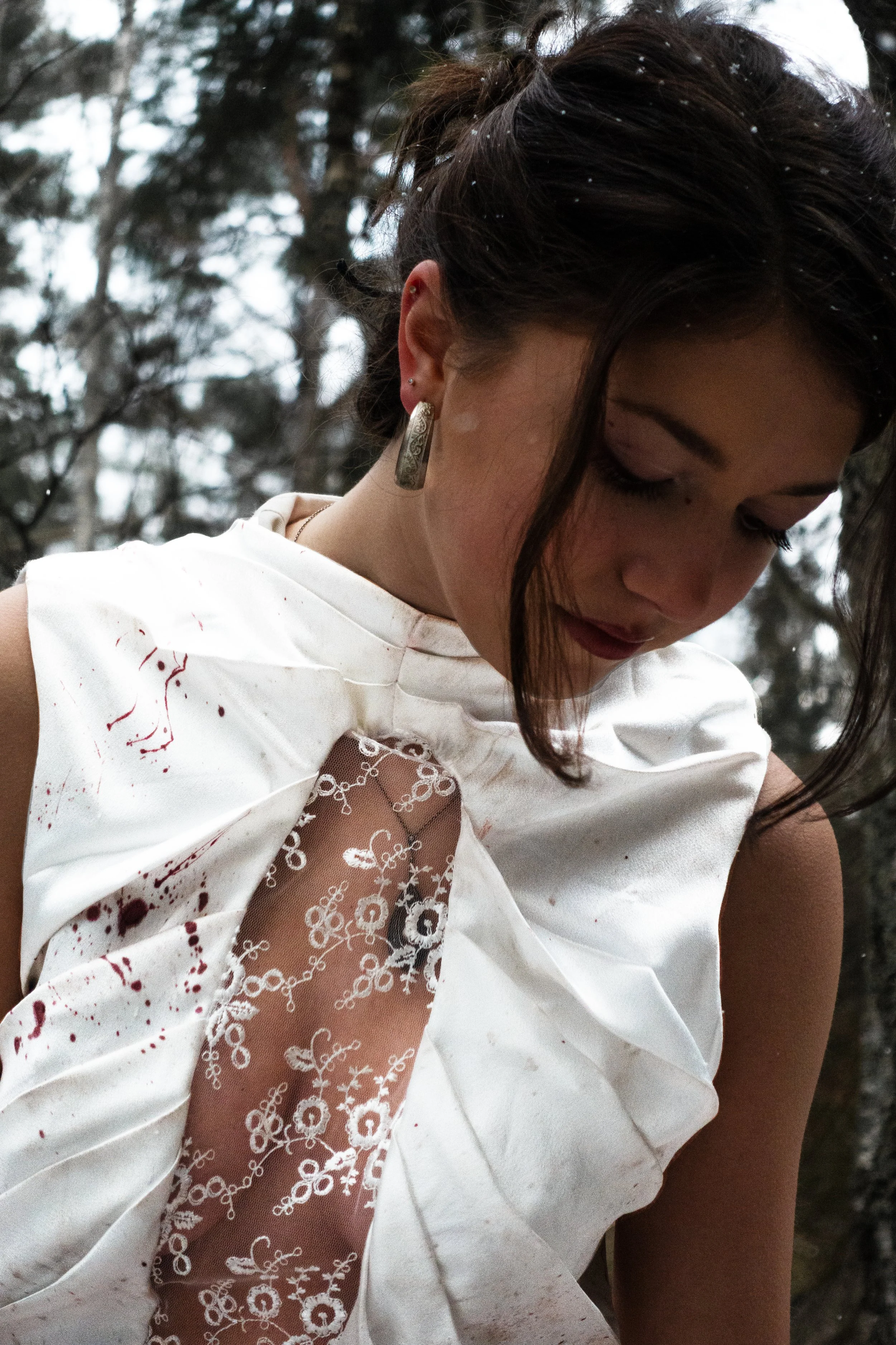
That’s why the dress is purest at the top, most stained and chaotic at the bottom, and has a “gray” transitional area in the middle, where the clean and the dirty coexist.
These are the deeper Yin & Yang elements of the piece—but the garment also plays with more surface-level contrasts:
Covered / exposed areas of the body
Clean / dirty
Time-consuming sewing techniques / Simple seams
PHOTOGRAPHy
Positive event (a wedding) / Negative event ( extreme amounts of blood)
photography, Editing, styling, creative directing by me


PROCESS
dress materials: viscose, polyester, cotton, metal hardware.i wanted the wedding dress to be something both elegant and sensual, yet also gritty, raw, and disturbing.
From the beginning, I had certain design elements in mind and chose to start draping directly on the mannequin without sketching first, which helped speed up my process.


After draping the bodice, I already had a clear vision for the lower part of the dress: a pleated mini skirt combined with several layers of lace strips in varying lengths, leading into a train at the back. I chose not to drape the mini skirt in order to save materials and shorten the process.
Once the draping was complete, I marked all the necessary lines, removed the fabric pieces from the mannequin, and transferred the pattern onto paper; adding all markings, seam allowances, and construction notes.

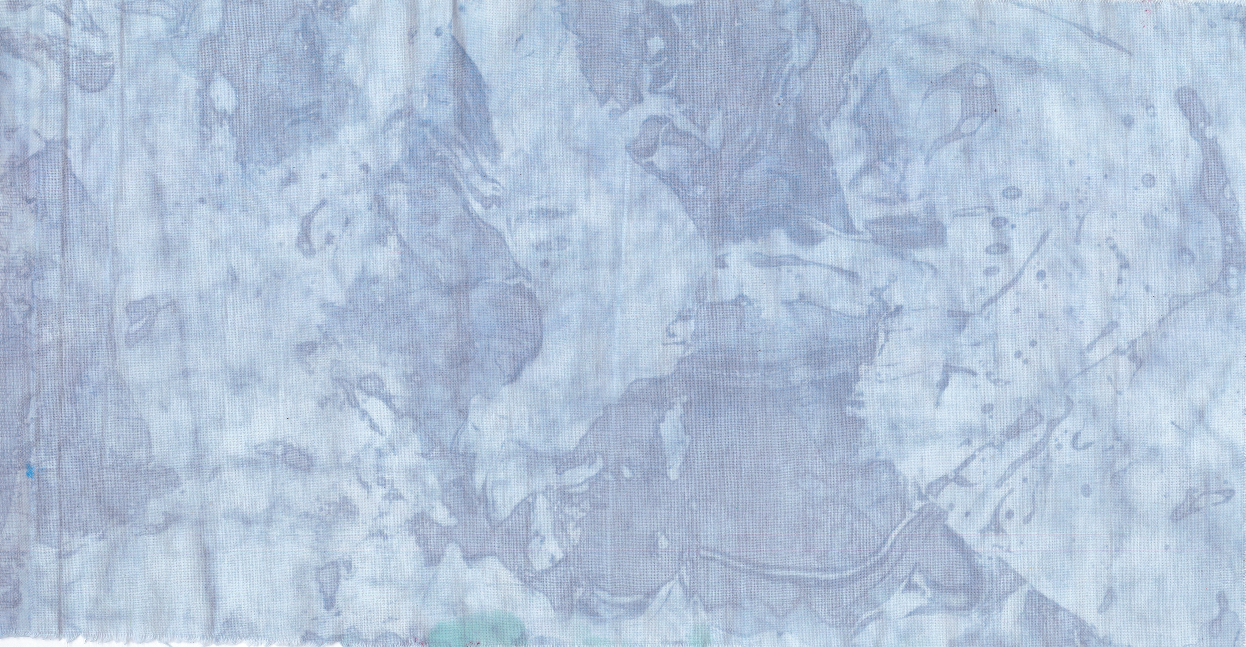
To achieve a more realistic blood texture, I conducted a series of color tests. experimenting with various materials and techniques to determine the most effective approach. both for this project and for future work. In my initial samples, I diluted textile paint with water to allow for easier fabric dipping and absorption. I prepared three separate containers, each with a different shade, to streamline the process and for clearer documentation.

Blue Dye Test – Oil
This sample explores the interaction between oil and textile dye, with a focus on creating separation and naturales patterns.
Since textile dyes are water-based, they naturally repel oil. This means that the dye will not adhere to areas where oil has been applied first—and vice versa. I used this property to experiment with layering, texture, and unpredictability.
In the first test, I painted sunflower oil onto selected areas of the fabric before dipping it into the dye and rinsing off the excess oil and pigment. However, the result felt too controlled for my concept.
To create a more organic, chaotic effect, I moved on to a second method: pouring oil directly into the dye bath dipping the fabric, then rinsing. This produced a much more dynamic and interesting result, better aligned with the feel I was aiming for.

Red Dye Test – soil
This test explores the use of soil as a texture and pigment modifier in textile dyeing.
I began by mixing soil into the red paint and dipping the fabric into the mixture. Afterward, I smeared additional soil directly onto the surface and let it dry.
The result created a heavier, textured finish and significantly darkened the red tone, giving the fabric a more raw look. This mixture adds an organic, messier feel to the material, both visually and Texture wise.


Green Dye Test – Latex
This test focuses on combining latex with textile dye to enhance both texture and color intensity.
Latex pairs particularly well with water-based dyes because it helps the color stay vibrant after drying—preventing the typical fading that can occur. Additionally, latex adds a firmer texture and structure to the fabric.
used the same way to Incorporate latex as the blue oil tests.
In the second piece, you can see areas where the original color remains unwashed, trapped by the latex which bonded with both the pigment and the fabric—creating a layered, almost preserved effect.
Based on the results from my dye tests, I decided that the "blood" effect on the dress would be created using slightly diluted textile paint mixed with dirt and latex. This combination would give the fabric the texture of having been dragged through dirt and dried coagulated blood.
Later in the process, I chose to develop four shades/versions of "blood". Each version was designed to evoke a different phase of drying and clotting, both visually and Texture wise, Giving a realistic feel to the final garment.
1. The darkest and thickest version – containing the highest concentration of soil and latex, with minimal added water.2. A lighter version – using the same amount of latex and soil, but heavily diluted with water.3. A pigment-dominant version – mostly textile paint with only a small amount of soil.4. A very light red – a highly diluted solution with a large amount of water.sewing
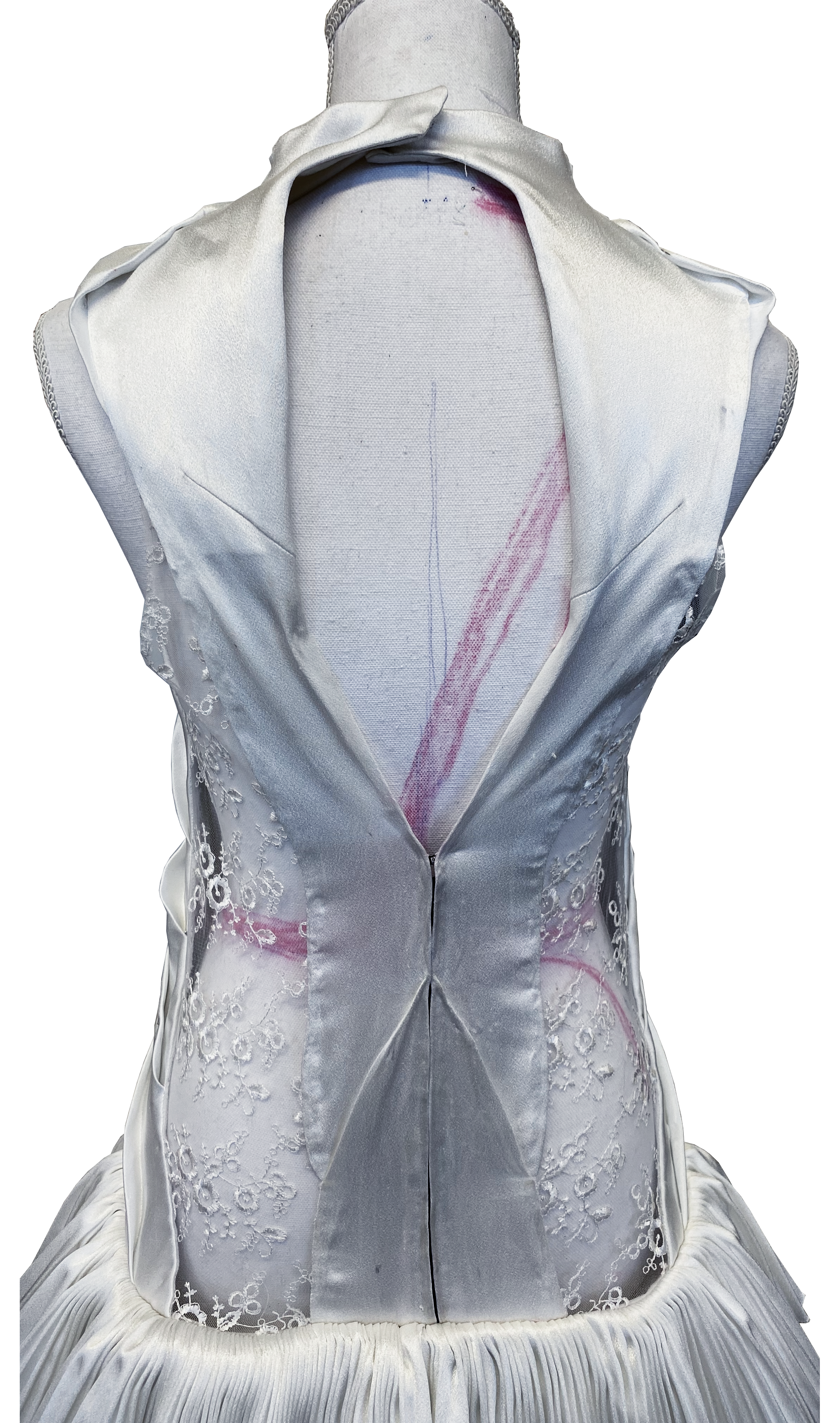
The dress features an elongated figure fitting Upper-body, with folds repeating top to bottom on the front, cotton lining front—upper back, lace window that ends below the hip. and an open back, lace windows on the back-sides, press button and hook back neck, zipper and hooks with two folds middle back.
Bottom part Consists of a tight pleated mini skirt made with a hand folded pleat template with 1 cm folds. Also a longer skirt with a train made from independent lace strips in 4 Different lengths and patterns.
Upper-body reverse sewn and Seam-allowance by the lace windows Hand-sewn to be hidden. miniskirt and lace strips connected to upper body with french seams and hidden with bias band on each side.
5 Metal hooks Hand-sewn on upper back after distressing and dyeing.


DISTRESSING
BY MASSAGING IN AND STEPPING ON THE DRESS WITH SOIL, ROCKS AND SNOW


dYEING
USING THE THREE red HUES, COLORED THE DRESS LIGHT TO DARK and BOTTOM TO TOP.CREATING a gradient from VERY BLOODY on the bottom TO LESS BLOODY THE HIGHER I WENT. ending WITH scattered stains/ spatter ON THE UPPER BODY.


